The mark of simplicity:
uniting a global brand
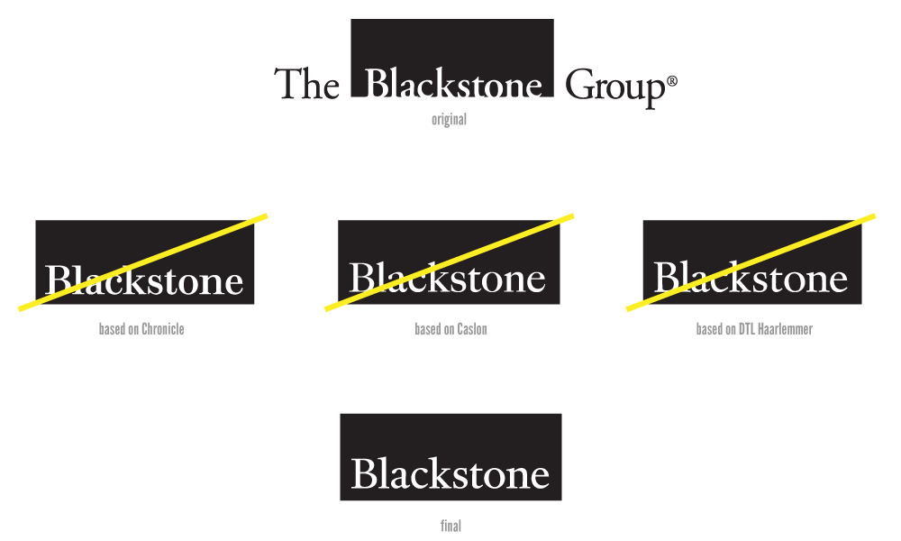
The Blackstone Group rebrand created an iconic mark and brand system to support Blackstone, its partners and holding companies. Although the logo appears simple, we spent months selecting the right typography and commissioning Kris Sowersby to create the custom logotype.
Bold simplicity
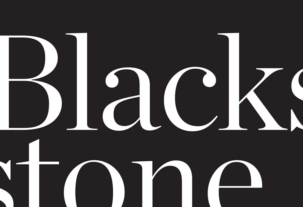
The bold logo is supported by the bold use of the Chronicle type family and commissioned photography. The print touch-points rely on these elements to stay fresh and consistent. Message and figures are bold across these designs, with easy-to-skim design.


New behaviors
After completing the brand standards, I spent 6 months working with the development team to design a pilot intranet site. From user research, we knew that the previous intranet wasn't considered a valuable resource. Most employees started their day with the news, social media platforms, and stock monitoring. Respecting this, we created a homepage that brought together company news and tasks with global news and stock monitoring.
Navigation bar

Homepage

Employee search grid view

Employee search list view

In the user research, we discovered the most valuable tool in the previous intranet was the employee search. Employees liked being able to browse each other's profile in an almost facebook like fashion. For the new intranet we included two views for the employee search. A quick thumbnail view, and a deeper dive list view.